
Final Version
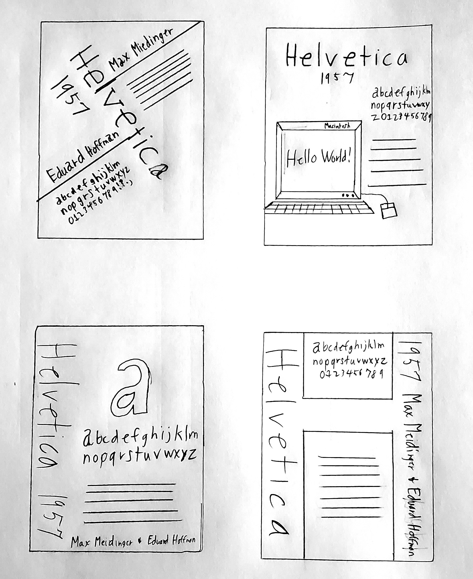
Below are some thumbnails of how the poster was going to be laid out. The main things I wanted to highlight in these thumbnails were the use of a dynamic grid and including the name of the font being researched.
Thumbnail set #1
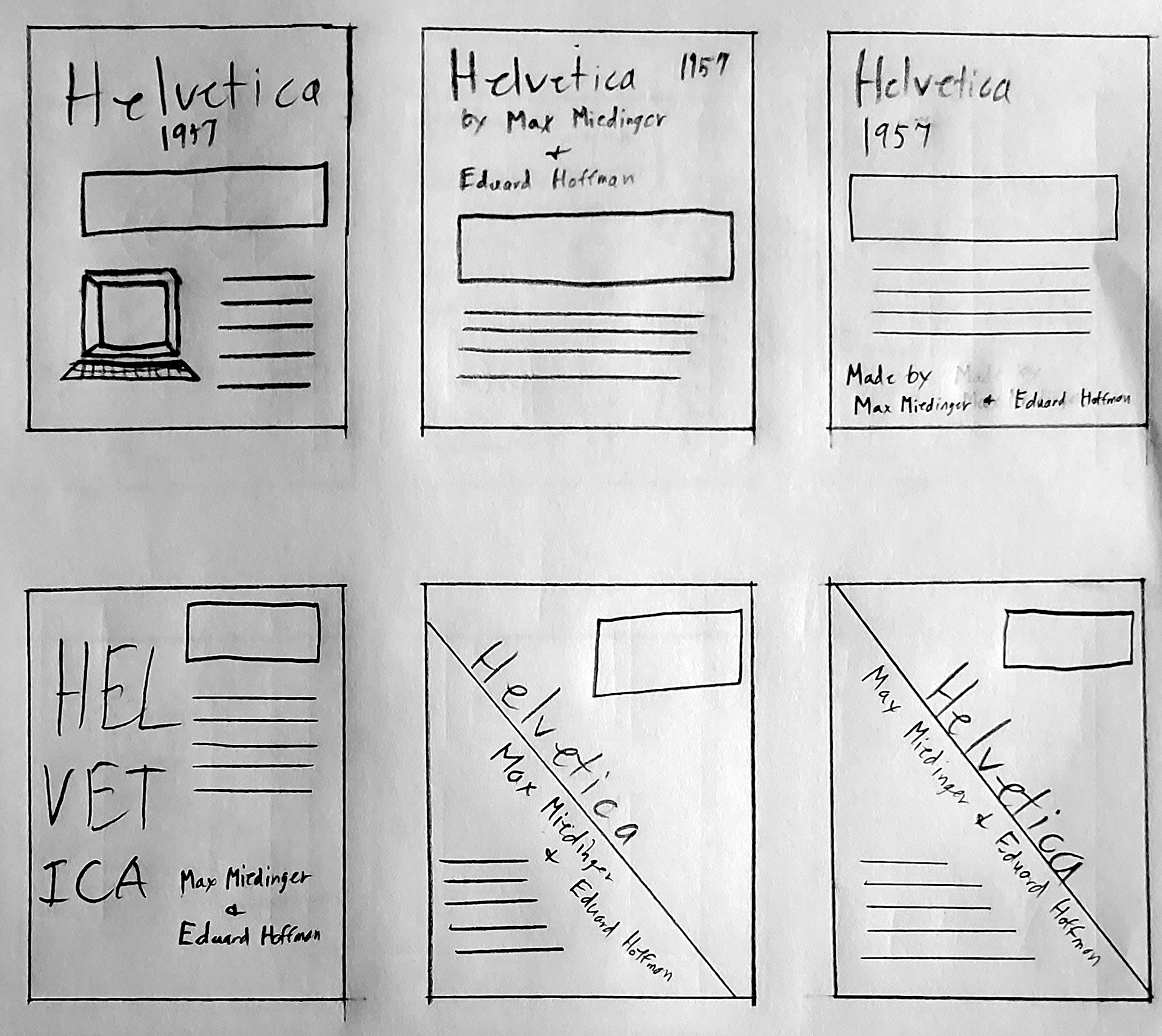
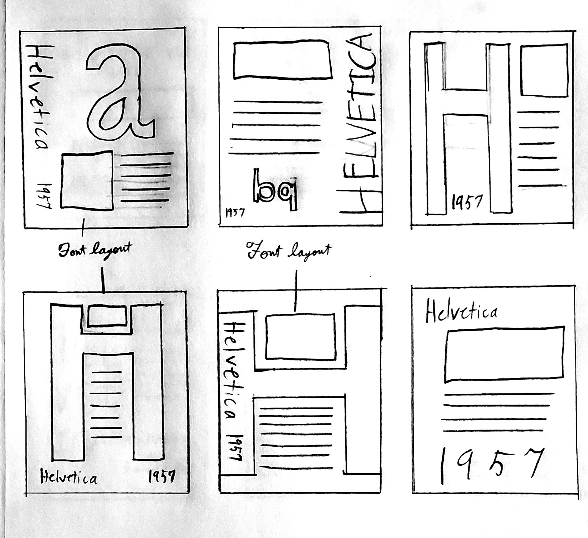
Thumbnail set #2
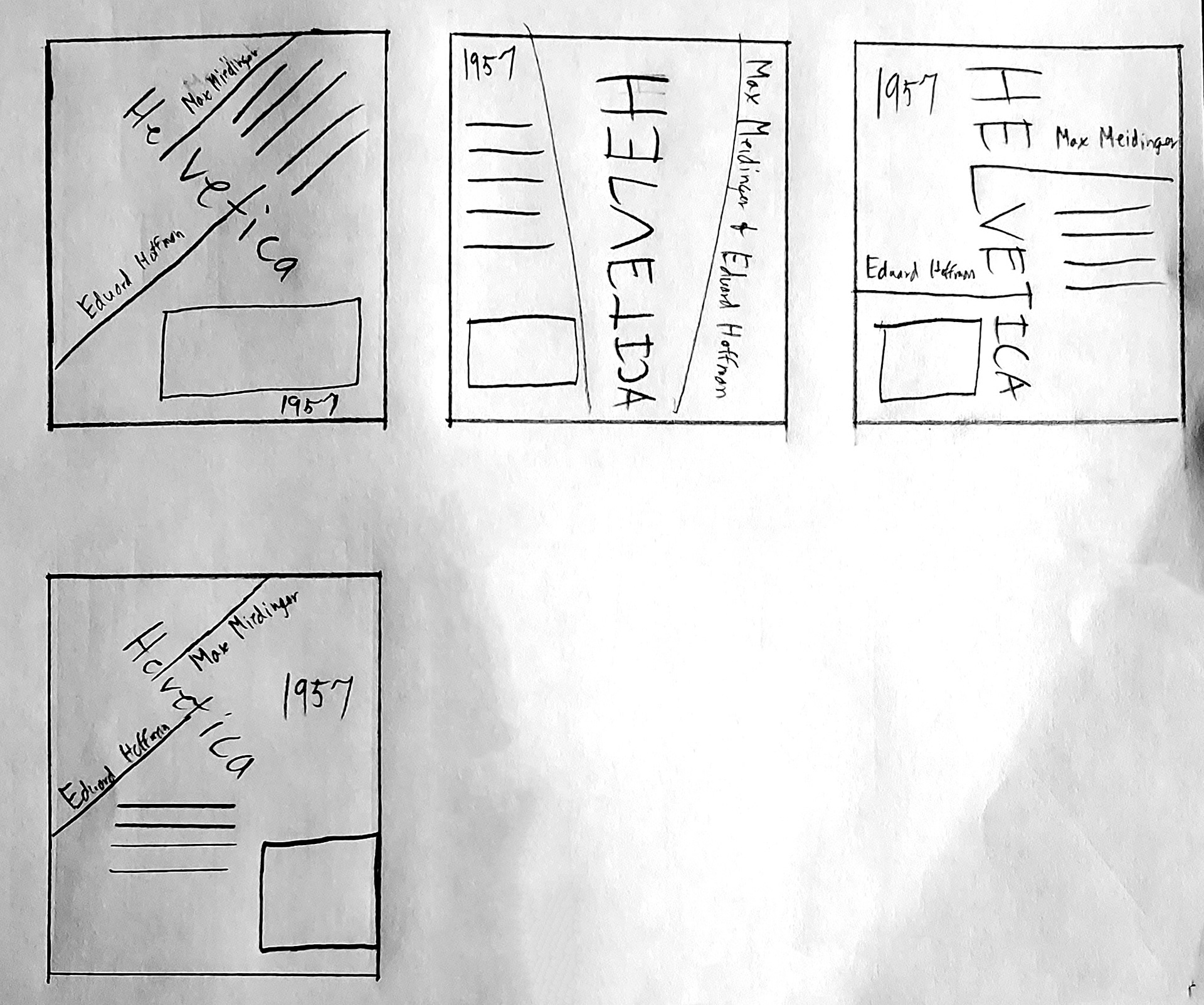
Thumbnail set #3
From there, I chose four of my thumbnails and added some more details to them which then made them into roughs. I thought it would be cool to include the Macintosh in one of my roughs because of the significance Helvetica played in the time era. After creating the roughs, was creating the final piece. The parts of information that are presented are: the font's name, the creators of the font, a character layout of the typeface, the year it was created in, and a paragraph or more that goes more into depth about the research that I did.